unTold — A Case Study

Design Challenge
Women leave their careers in tech at a much higher rate than the men they work with do. The rate is about 41% of women leave versus 17% of men. In addition, there are 5 times as many men in tech than women (17%). This creates a catch-22. Women are underrepresented in tech and, therefore, have a harder time dealing with the problems that cause them to leave in the first place and as a result, they end up leaving tech. This lead me to the following how might we question.
How might we give women the tools they need to not only survive, but to thrive in a career in tech?
UX
Key Research Insights
The key reasons that women leave tech are also surprising. Intuitively, one would think it would be due to harassment. However, the reasons are more complicated. According to one article, women leave tech because “they’re treated unfairly; underpaid, less likely to be fast-tracked than their male colleagues, and unable to advance.” (source)
The most surprising discovery that came out of the secondary research, and to a lesser degree from the primary research, was that the intuitive solution–mentoring–doesn’t solve the problem. When women are mentored, a “lack of relevant, actionable feedback holds women back from making the changes they need to advance their careers.” Instead of mentorship, women need sponsorship or advocacy.
Opportunity Selection
Unfortunately, both the primary and secondary research showed that the main problem was sociological. This meant a people solution was needed; an app wouldn't really help. The project had to pivot.
Time to Pivot
As I was thinking through how to move forward with the project several things came up that pointed me towards the idea of storytelling and structuring the design challenge around a community for women in which they could safely share stories.
Retrospectives
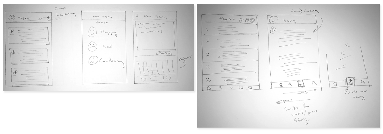
The first was a quick sketch I did based on the canonical retrospective format of a happy, sad, and confused face. People were able to easily and quickly understand what the faces meant and how one could use them to classify events that had happened.
Power of Storytelling
Next, I remembered an incident that took place on a team I was leading. One of the women on the team was struggling at work due to an incident with a coworker. I convinced her to tell her story to someone instead of keeping it inside. A few weeks later she came into work with a smile on her face. She had shared her story and was able to start to heal. This healing aspect of storytelling was also mirrored in a TED talk I watched.
The last was something that came out of one of the interviews I did. One women said that there was power in sharing stories with the other women on her team. These ideas combined caused me to start looking at storytelling as a way to strengthen and empower women.
Importance of Safety
The idea of an invite-only, exclusive community came from the realization that for women to share sensitive work stories, the community had to be safe and, therefore, not open to just anyone. It had to feel like a group of friends.
Personas
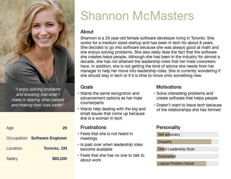
After talking to several women in tech, the following persona was created based on common traits. A persona puts a human face on the app's users and helps remind the team that they are building it for real people.
Experience Journey
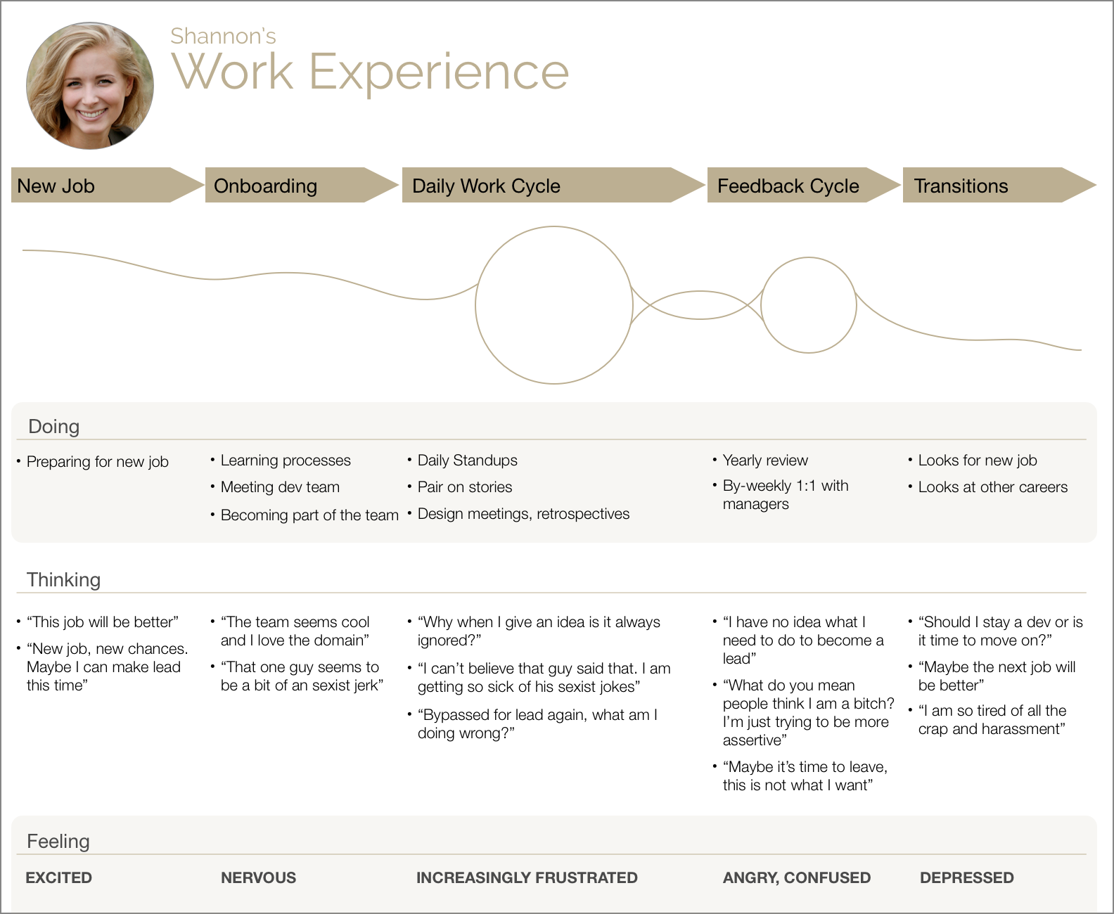
In order to cement my understanding of Shannon, I created an experience map. This allowed me to identify opportunities where her work experience could be improved. It also helped me better understand how she might be feeling and thinking when sharing stories and the kinds of stories she might share.
Task Selection
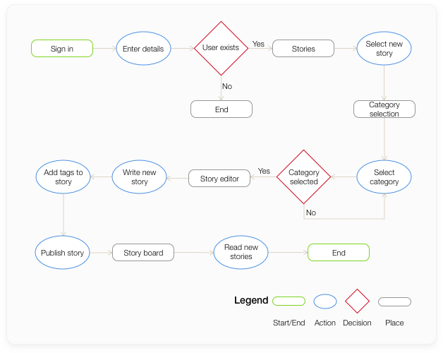
The experience map helped to solidify the importance of having a community with which Shannon could stories that arose as she went through her day to day work cycle. The next step was to create user stories and pick the initial user task. I decided to concentrate on sharing a story with the community. Below is the task flow diagram.
Task Flow Diagram
UI
Project Constraints
For this project, there were two constraints imposed by the client:
- The final design had to be WCAG AA compliant
- The final solution must be a mobile app
Pen and Paper Sketches
Once the UX was understood, I started designing by creating some pen and paper sketches. This allows for rapid ideation via quick iterations. Below are the initial sketches that I created. One of the initial driving ideas for the UI was a team retrospectivel, specifically, the canonical Happy, Sad, and Confused faces under which post-it notes are placed.
Wireframes
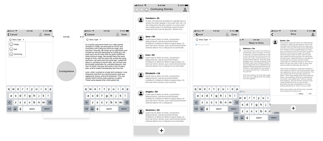
After sketching out a few basic screens and UI components, I switched to Sketch and created simple wireframes to test the overall user experience and flow. These screens were based on Twitter and how it displays tweets in a continuous feed. Below are screens for viewing the main story feed, writing a story, and viewing a single story.
Medium Fidelity Layouts
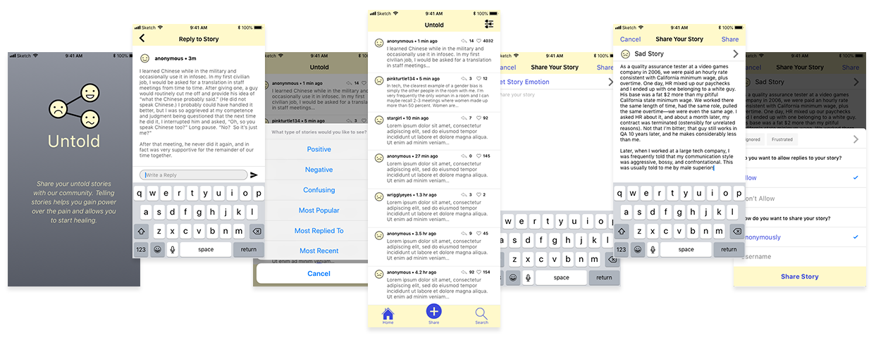
Once the basic flow and user experience was tested, the next step was to start injecting colour and raising the fidelity of the designs.
Visual Identity Story
UI Inspiration
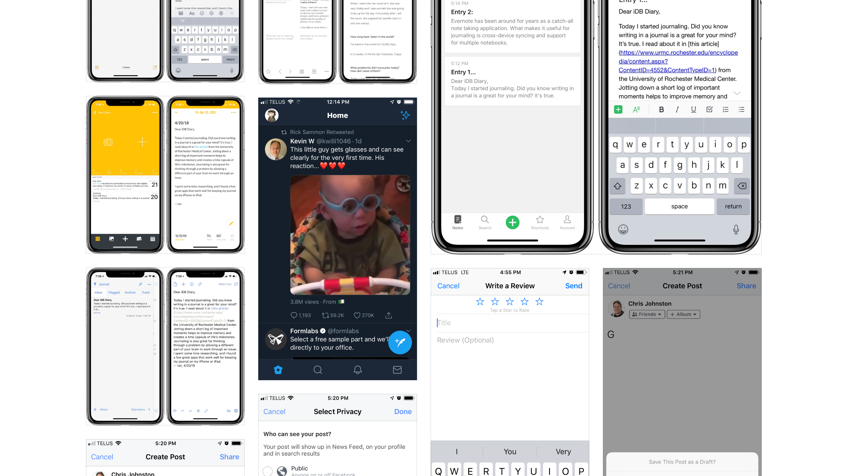
The initial inspiration for the design came from Twitter and journaling and note taking apps such Day One and Apple Notes. The latter showed patterns for fullscreen writing while the former was more for what became the story feed. To help, I created a UI Inspiration board in InVision.
The Colour Yellow
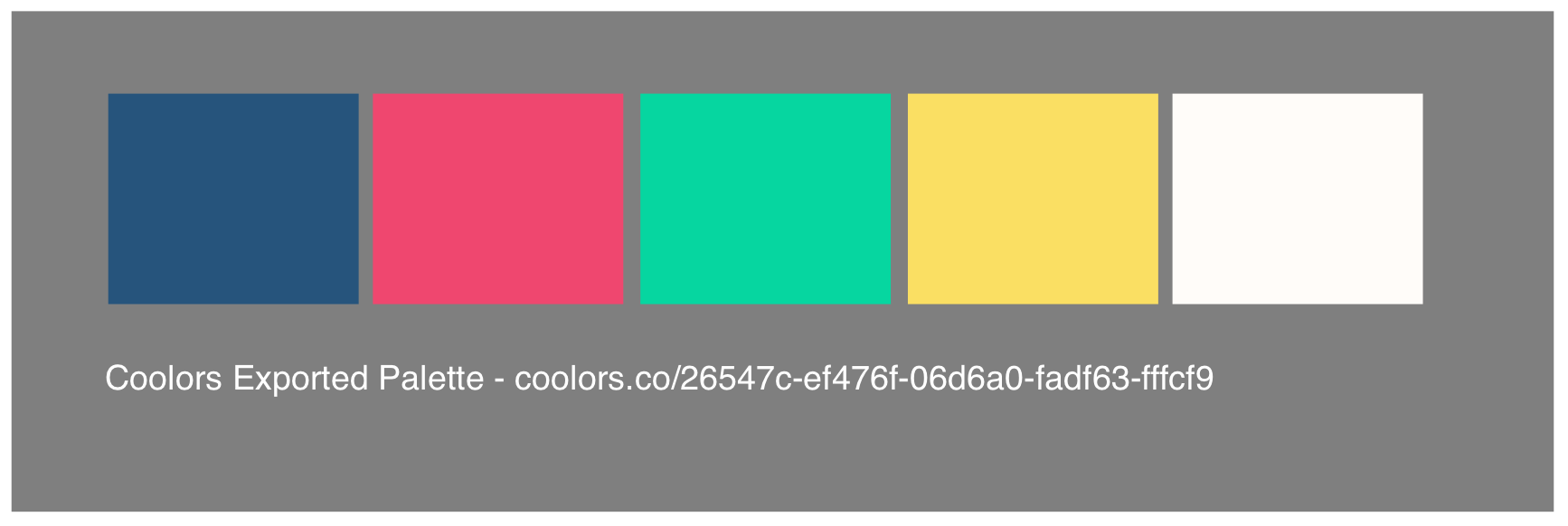
From the beginning, I wanted a colour that was inviting and warm. I also had the idea that I wanted a feminine colour that wasn't too "girly". As such, pink was out. I zeroed in on the colour yellow. After trying different colour combinations using an online tool called Coolors.co, I decided to use the paletter shown below. I used yellow as the main background colour and blue to show interactive elements. The red and green were used for error and success states.
This was probably the hardest part of the overall project for two reasons.
- Due to the restrictions above, I had to find a background/foreground colour combination that was WCAG AA compliant. This meant a lot of softer, pastel colour combinations weren't feasible.
- I am new to colour and struggled a lot to find the right colour paletter. And based on feedback, it is something I am still struggling to get right.
UI Changes and Decisions
As the design matured, there were many changes that came about from user testing and discussions with other designers.
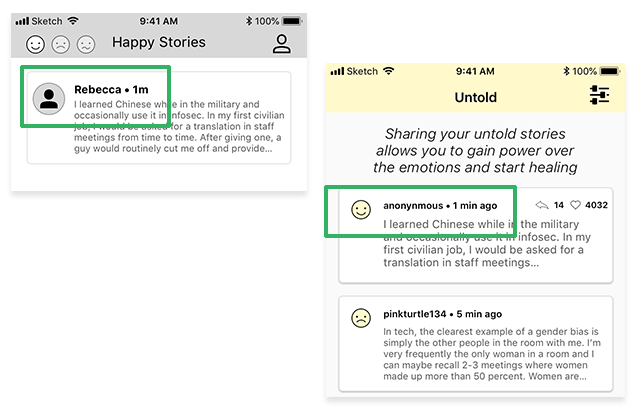
Anonymous Stories
Originally, stories were shared using a person's first name and a profile picture; however, women shared that this made them very uncomfortable since they were sharing sensitive stories. Being able to share stories anonymously or using their username was okay.
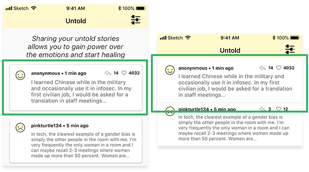
Story Card Changes
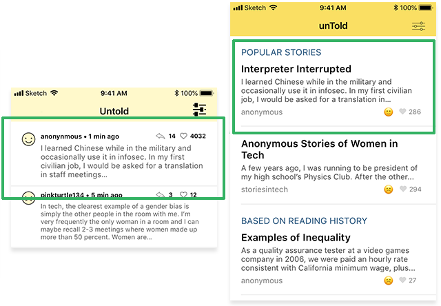
I changed the format of the story card. The initial format is on the left with the next iteration on the right. The rectangle made it difficult to fit the story elements to a four column layout and took up a lot of precious space. Using a full-width row allowed for more of a story to be displayed. This means the user can get a better feel for what a story is about.
Titles and New Emojis
After looking at Medium and other story based, I realized the following changes needed to be made.
- Titles were added so that it was easier for people to scan the story feed.
- The emojis were deprioritized to show as much text as possible, once again to allow users to make better decisions about what stories to read.
- The emojies were also changed to the standard ones that everyone is used to seeing. This was done in order to make recognition faster and reduce surprises.
- Finally, section headings were added to give more of a curated feel to the stories being displayed.
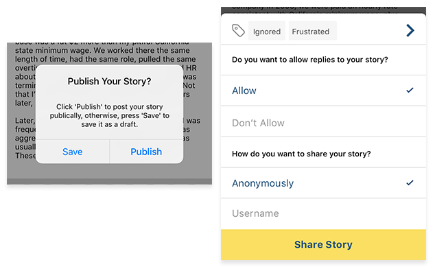
Publishing Settings
In addition to removing the username and profile picture when showing stories, how stories are published also changed to give full control to the women using the app. Along with allowing for stories to be published anonymously, the publish settings allow for replies to be turned off.
Once again, in user testing, women expressed the fear of receiving negative replies and how this would make them feel worse instead of building them up.
Tags were also added to help with story discovery.
Final Designs
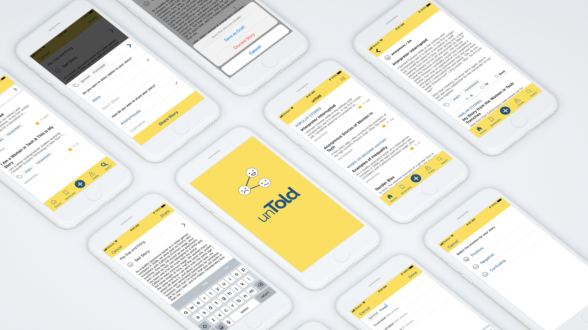
After many iterations, below is the current state of the app.
Design Impact / Future Thinking
If I had more time, there are a few things that need to be changed and a few things that I would like to investigate.
- I have received feedback that the colour is off and has resulted in an interface that does not feel as safe or comforting as it could.
- The happy, sad, confused faces/emojis, beyond the original idea, have not really resinated with users. In user testing, people simply pick one and quickly move on with no comments.
- Searching for, and discovering, stories is an underdeveloped area of the app that is just as important as sharing a new story.
Key Project Learnings
This project turned out to be an interesting learning experience for me. Below are the highlights:
- The subject of helping women in tech is a very emotional one for women and I was not completely prepared for all the amazing, but emotionally charged discussions that resulted.
- As the project progressed, I realized more and more that I wasn’t creating an app, but a community that is accessed through various ways (mobile, web, etc)
“I strive for two things in design: simplicity and clarity. Great design is born of those two things.”—Lindon Leader
